
The Godrej Logo Controversy: What Legacy Brands Can Teach Us About Identity, IP and Innovation?
Godrej's new minimalist GI identifier logo triggered a viral debate over its resemblance to Guerrilla, an Australian agency. This blog breaks down what happened, how Godrej responded, and the key lessons brands must learn about originality, IP diligence, and protecting decades of brand equity.
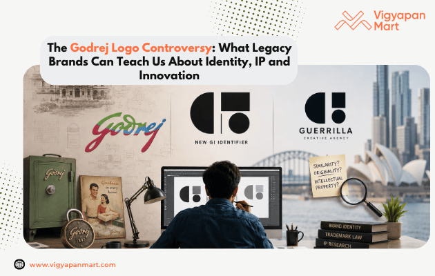
A logo may seem like a tiny sign on a package, billboard or website, but it can carry decades of recognition for a legacy brand.
The recent rebranding of Godrej created a buzz online because of its striking similarity to an Australian creative agency.
In April 2026, the company introduced a new minimalist geometric logo as ‘GI Identifier’.
Soon after the launch, the online audience immediately noticed the similarity between the new Godrej logo and the logo of Guerrilla, an Australian creative agency.
But the debate soon moved from Design Choices to Originality, Intellectual Property, and How Did A Brand of That Scale Miss It?’
Please note that this is not a legal battle between Godrej and Guerrilla. It was a branding controversy that online audiences started, discussed, and are still getting the hang of.
What Exactly Happened?
On 22 April 2026, Godrej Industries Group introduced its refreshed identity under the line “Crafting tomorrow since 1897.”
The new logo had a Geometric GI Identifier, custom typography, and a sonic identity. Everything that was needed to present the 130-year legacy and the next phase of growth.
But the real controversy starts here.
The new GI logo had a visual similarity to Guerrilla’s logo identity. Consumers started comparison, asking questions to the marketing team, and raising concerns about designs & creativity.
Now, the questions are:
- How can brands maintain simplicity & originality with minimal logos?
- How much similarity is acceptable when brands use basic geometric forms?
- Are there any legal concerns?
- Should we adapt legally accepted but compromised creatives?
These questions raise concern as the internet has removed the geographical boundaries altogether.
What Did Godrej Say About the Controversy?
Godrej leadership did respond to the criticism and defended the design process.
The company explained that the new GI identifier logo has been designed for company restructuring in 2024. The simple geometric logo is not replacing the original but will be working alongside the Godrej legacy signature. Plus, the logo is intended to represent the second arm of the company that manages chemicals, consumer goods and real estate.
"This GI identifier was chosen as we wanted something as elemental as possible. After completion of the design process, as part of our intellectual property diligence, we discovered numerous other marks using simple geometric composition like the GI identifier. A half circle, rectangle and circle combination appears across dozens of identities in multiple countries in varying sectors ranging from software to service agencies to medical devices.”
According to the Godrej leadership, resemblance in the category is not just common, it's structural. However, the whole incident has started due diligence on the work of DISCO, the in-house design studio of Godrej.
While Godrej suggests no ethical or legal impediment, the online market already seems confused about it.
Godrej Is More Than a Logo in Indian Homes:
The debate becomes more relevant when you understand the impact Godrej has in India. Founded in 1897, Godrej carries a 130 years of legacy and is a household name in India across multiple categories such as locks, furniture, appliances and personal care.
Godrej has the advantage of generational brand memory.
A consumer can easily recognise Godrej products just by seeing the signature. A visual identity is not just a design asset for Godrej. It is the legacy of 130 years of trust, respect, and connection.
This is why rebranding for legacy companies is not about creating logos. It's about protecting the generational legacy, memory, and recognition.
Amul Shows How Legacy Can Stay Relevant:
The Godrej rebranding is not a complete shift of visual identity, but it still sparks the conversations. Taking this into marketing perspective, another legacy brand, AMUL, has protected its IPs and legacy for over 50 years, becoming a case study itself.
Created by Sylvester da Cunha and Eustace Fernandes in 1967, the AMUL GIRL has been a central part of Amul’s advertising for almost six decades.
Her secret is simple.
The AMUL GIRL comments on everything- cricket, politics, entertainment and major cultural moments but her core visual identity always stays recognisable.
That offers a powerful branding lesson:
Change the expression. Protect the recognition.
Could the New GI Identifier Create International Confusion?
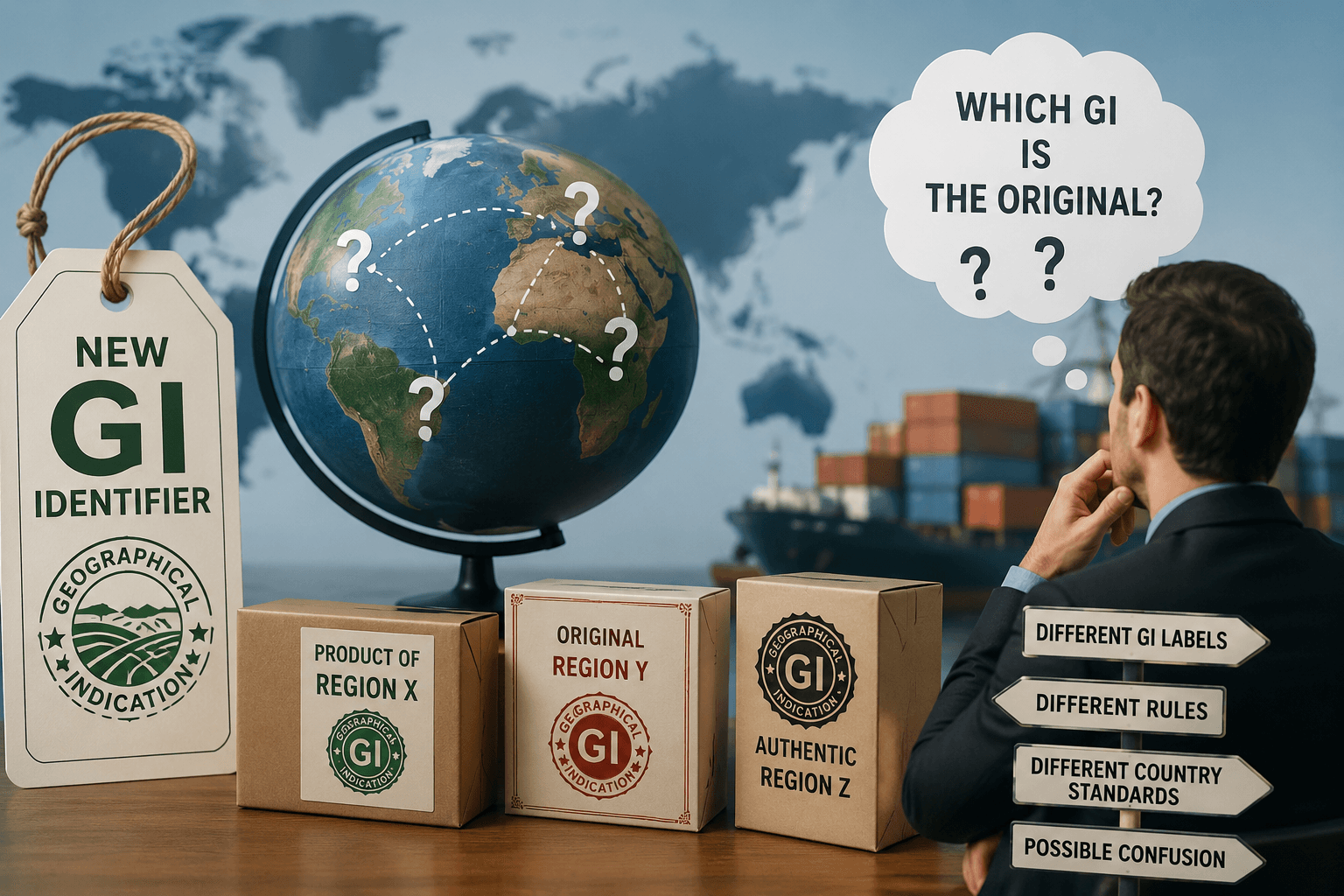
It would be too strong to claim that Godrej's new logo will create confusion internationally. But the controversy raises a valid question.
Since brands are going global, can visual similarity affect the results? Can it affect social media discovery, brand attribution and future trademark activity?
A similar identity may cause communication & reputational challenges even if companies work in different industries.
Conclusion:
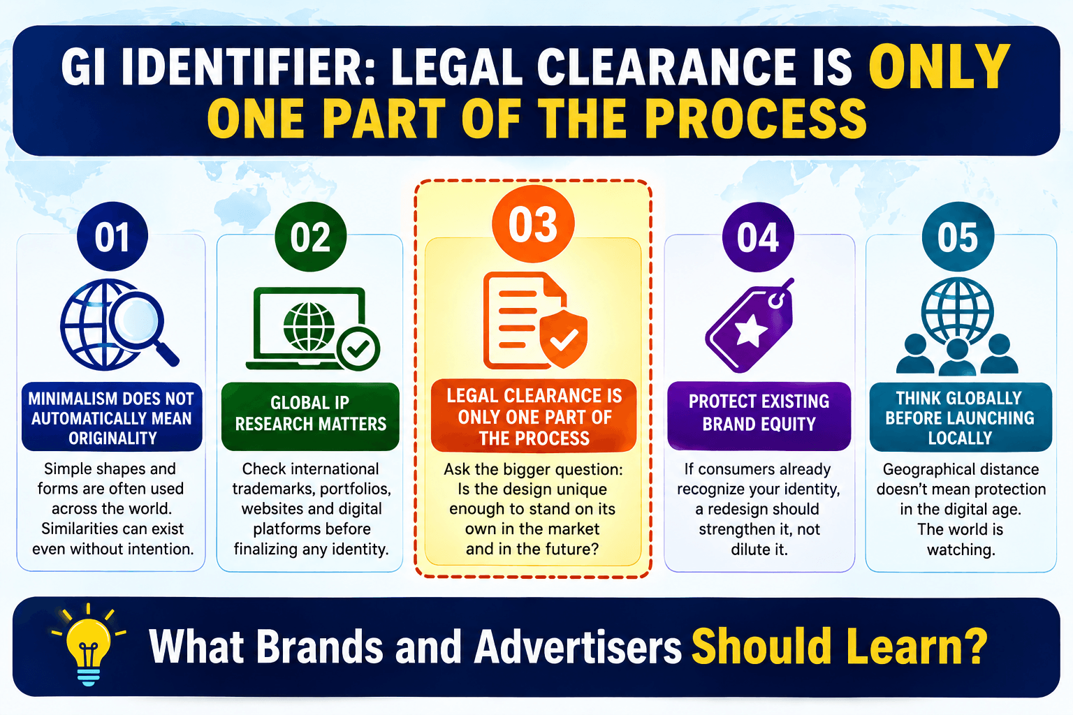
The Godrej episode is not against rebranding. Brands must evolve to stay relevant. However, it is a lesson about how they should evolve. A successful identity shift needs more than aesthetic appeal. It needs to be unique, more relevant, and respectful of the legacy.
For advertisers, the process should go beyond:
Create → Approve → Launch
It should become:
Create → Compare → Check → Challenge → Protect → Launch
At Vigyapan Mart, we believe that a rebrand should enjoy innovation but doesn’t fade away the memory. Because you can redesign a logo, but the meaning needs decades to build.
Working on rebranding and needs expert guidance? Connect with Vigyapan Mart today.
Subscribe to our newsletter
Get updates instantly! Join our community for the latest marketing insights.