Bright, Bold Colors vs. Subtle Palettes: Choosing the Right Color Strategy for Retail Signage
Retail signage color choice impacts attention, mood, and brand recall. Bright bold colors attract quick attention but can overwhelm, while subtle palettes offer elegance and trust. Choosing the right color strategy helps align signage with brand personality and customer expectations.
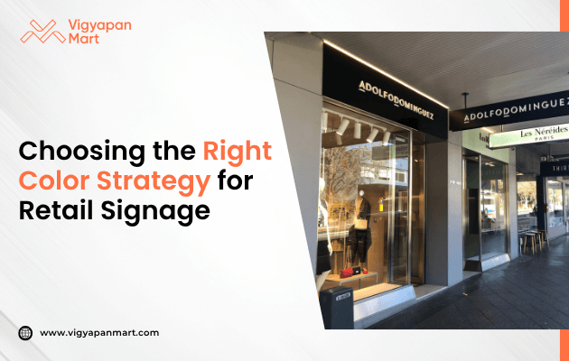
Retail signage is more than just words on a board. The colors you choose can make your store stand out or blend in. Picking the right color strategy is important for grabbing attention, sharing your message, and building your brand. Let’s explore the differences between bright, bold colors and subtle palettes, and how to choose the best one for your store.
Why Color Matters in Retail Signage?
- Color is powerful. Almost 85% of shoppers say color is the main reason they buy a product.
- First impressions count. People often notice your sign before anything else. Color helps them remember your brand.
- Color sets the mood. Different colors make people feel different things. For example, blue can feel calm, while red feels exciting.
- Color helps with visibility. The right color combination makes your sign easy to read, even from far away.
Bright, Bold Colors: The Pros and Cons
What are they?
Bright, bold colors are shades like red, yellow, orange, and neon green. They are eye-catching and full of energy.
When to use them
To grab attention: Bright colors make your sign pop, especially in busy places.
For promotions: Use them for sales or new products you want everyone to notice.
For fun brands: If your brand is playful or targets kids, bold colors can match your personality.
Pros
- Easy to spot: People notice bold colors quickly, even from a distance.
- Creates excitement: Bright colors can make shoppers feel happy and energetic.
- Helps with brand recall: Unique color choices can make your brand memorable.
Cons
- Can be too loud: Too many bright colors can feel overwhelming or even cheap, especially for luxury or professional brands.
- Hard to read: Some color combos (like yellow on white) are tough to see and can hurt your eyes.
- Trendy, not timeless: Neon and other bold colors may go out of style quickly.
Subtle Palettes: The Pros and Cons
What are they?
Subtle palettes use soft colors like beige, gray, navy, and pastels. These colors are calm and gentle.
When to use them?
- For luxury and professionalism: Subtle colors make your store look classy and trustworthy.
- To highlight products: Soft backgrounds help your products stand out without distraction.
- For timeless appeal: Neutral colors stay stylish year after year.
Pros
- Feels elegant: Subtle palettes create a sense of calm and sophistication.
- Improves readability: Simple color schemes make signs easy to read.
- Works well with many brands: Neutral colors fit most industries, from fashion to finance.
Cons
- Might be overlooked: In a busy area, soft colors can blend in and be missed.
- Less exciting: Subtle colors don’t create the same energy as bold ones.
- Needs good design: Without contrast, subtle signs can look boring or be hard to notice.
Key Tips for Choosing Your Color Strategy
1. Know Your Audience
- Kids and teens love bright, playful colors.
- Adults may prefer calm, trustworthy shades.
- Think about what your shoppers like and expect.
2. Match Your Brand
- Your sign should look like it belongs to your brand.
- Use your logo colors or choose shades that fit your brand’s personality.
3. Think About Location
In a colorful mall, subtle signs can stand out. On a quiet street, bold colors might be best for getting attention.
4. Focus on Contrast
High contrast (like black on white) makes signs easy to read. However, avoid color combos that are hard to see, like yellow on white or red on green.
5. Test Your Design
- Look at your sign from far away.
- Ask friends or customers what they think.
- Try your sign in different lights to see how it looks.
Fun Facts About Color in Retail
- Color boosts brand recognition by up to 80%.
- White space is important: Don’t fill every inch with color. White space helps your sign “breathe” and makes it easier to read.
- Color meanings change: In some cultures, red means luck, while in others it means danger. Always check what colors mean to your customers.
Conclusion
There’s no one-size-fits-all answer. Bright, bold colors are great for attention and excitement, while subtle palettes offer elegance and trust. The best color strategy is the one that fits your brand, your message, and your shoppers. Remember to use contrast, keep it simple, and always test your design before you decide. With the right colors, your retail signage can turn heads and bring more customers through your door. Want to explore the power of color strategy for retail branding? Connect with Vigyapan Mart advertising experts today.
Subscribe to our newsletter
Get updates instantly! Join our community for the latest marketing insights.