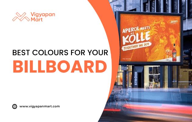
How to Choose the Best Colors for Your Billboards?
Learn how to choose the best colors for your billboard ads with proven principles of contrast, branding, and color psychology. Explore tips for readability, emotional impact, and environmental context to make your ads pop.
Billboards are a powerful tool to grab attention and communicate your message quickly. You have only a few seconds and the colors you choose can make or break your billboard’s success. In this blog, we’ll explore how to select the best colors for your billboard to ensure it stands out and delivers your message effectively.
Why Colors Matter in Billboard Design?
Colors play a significant role in attracting attention, evoking emotions, and improving recall. Studies show that colors can increase ad recall by up to 38%, making them a critical element in billboard design. Here’s why:
- Visibility: Bold and contrasting colors make your billboard readable from a distance.
- Emotional Impact: Different colors evoke specific emotions (e.g., red conveys urgency, blue builds trust).
- Brand Recognition: Consistent use of brand colors reinforces identity.
Key Principles for Choosing Billboard Colors:
1. Prioritize High Contrast
High contrast ensures that your text and images are easily readable from afar. For example:
- Black text on a yellow background is excellent for urgent messages.
- White text on blue backgrounds creates a calm and professional look.
Avoid combinations like light gray on white or dark blue on black, as these reduce readability.
| Background Color | Text Color | Visibility Impact |
|---|---|---|
| Black | Yellow | Excellent |
| Red | White | Bold and striking |
| Dark Blue | White | Professional |
| Yellow | Black | Highly visible |
2. Opt for Bold and Bright Colors
Travelers often view billboards while moving quickly, so subtle or pastel tones won’t stand out.
Use fully saturated colors like red, orange, and yellow to grab attention. However, avoid overusing bright hues as they can overwhelm the design.
3. Limit Your Color Palette
Too many colors can confuse viewers and dilute your message. Stick to three dominant colors for a clean and cohesive look. This focused approach enhances clarity and ensures your design remains impactful.
4. Align with Your Brand Identity
Use colors that reflect your brand’s personality and values. For example:
- A tech company might use blue for trustworthiness.
- An eco-friendly brand might opt for green tones to represent nature.
Consistency between your billboard design and other marketing materials strengthens brand recognition.
Color Psychology: What Do Colors Say?
Understanding color psychology helps you align your billboard’s message with the audience's emotions:
- Red: Urgency, excitement, passion.
- Blue: Trust, stability, calmness.
- Yellow: Optimism, attention-grabbing.
- Green: Growth, nature, wealth.
- Orange: Energy, enthusiasm.
Choose colors based on the feelings you want to evoke in viewers.
Environmental Context Matters
Where your billboard is located affects its color choices:
- In urban settings with grey backdrops, bright colors like yellow or orange stand out.
- In natural environments with greenery, avoid earthy tones that may blend in; instead, use bold contrasts like red or blue.
Tips for Day vs. Night Visibility
Billboards must be readable under different lighting conditions:
- Daytime: Use bold and saturated colors that resist washing out under sunlight.
- Nighttime: Opt for dark backgrounds with bright text to improve readability on illuminated billboards.
Testing designs in various lighting scenarios ensures consistent visibility.
Accessibility and Inclusivity
Consider viewers with color blindness or other visual impairments. Tools like color blindness simulators can help ensure your billboard is inclusive. For example:
- Avoid red-green combinations as they can be difficult for colorblind individuals.
- Test designs in grayscale to confirm strong tonal contrast.
Examples of Effective Billboard Designs
Some iconic brands have mastered the art of color contrast:
- Coca-Cola uses white text on a red background for bold visibility.
- McDonald’s pairs yellow arches with red or black backgrounds for instant recognition.
These designs are simple yet impactful due to their thoughtful use of color.
Common Mistakes to Avoid
Avoid these pitfalls when choosing billboard colors:
- Using too many colors—this creates clutter.
- Pairing low-contrast combinations like pastel-on-pastel.
- Ignoring environmental factors (e.g., blending into surroundings).
- Not testing designs under different lighting conditions.
Conclusion
Choosing the right colors for your billboard is both an art and a science. Here are some tips to follow:
- Prioritize high contrast,
- Limit your palette,
- Keep consistent brand identity, and
- Consider environmental factors
Follow these and you can create billboards that grab attention and leave lasting impressions. One last tip to Remember: simplicity is key to great design! Want to know more about colors and they impact your ads? Connect with Vigyapan Mart experts.
Subscribe to our newsletter
Get updates instantly! Join our community for the latest marketing insights.