How to Choose the Best Colours for Your Billboard?
Billboard success depends on using the right colours. High-contrast pairs, bold hues, and colour psychology make ads more visible and memorable. Matching colours with brand identity ensures outdoor billboards stand out and attract attention effectively.
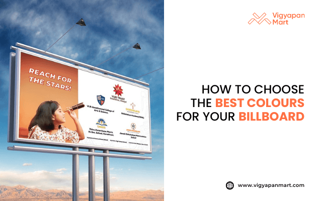
Billboards are everywhere; on highways, in cities, and even in the countryside. But not every billboard gets noticed. One big reason some billboards stand out is because of the colours used. Choosing the right colours can make your message easy to read and hard to forget. Here’s a simple guide to help you pick the best colours for your billboard.
Why Colours Matter?
- Colours grab attention. Bright, bold colours can make people look at your billboard, even if they’re driving fast or walking by quickly.
- Colours help people remember. Studies show that using high-contrast colours can help people remember your ad up to 38% better.
- Colours show feelings. Different colours make people feel different things. For example, red can feel exciting, while blue feels calm.
Use High Contrast for Easy Reading
High contrast means using colours that are very different from each other, like black and yellow or white and red. Why is this important? High contrast makes letters and pictures stand out, so people can read your message from far away.
Best colour pairs
- Black text on yellow background
- White text on red or dark blue background
- Yellow text on dark blue background
Colours to avoid
- Light blue on white (too hard to read)
- Dark text on dark backgrounds
- Neon colours together (hurts the eyes)
- Pastel on pastel (too soft to stand out)
Choose Bold and Bright Colours
- Bold colours like red, orange, and yellow are great for catching attention.
- Use bright colours for important messages but don’t use too many, or your billboard will look messy.
- Limit your palette: Stick to 2 or 3 main colours. This keeps your design clean and easy to understand.
Match Colours to Your Brand
Use your brand colours if you can. This helps people remember your business and makes your billboard match your other ads.
Think about your brand’s personality
- Tech companies often use blue for trust.
- Eco-friendly brands use green for nature.
- Luxury brands use black or gold for a fancy feel.
Understand Colour Psychology
Colours can make people feel certain emotions. Here’s what some common colours mean:
| Colour | What It Means | Good For |
|---|---|---|
| Red | Urgency, Excitement | Sales, Quick Action |
| Blue | Trust, Calm | Banks, Tech, Professional Cab |
| Yellow | Happiness, Attention | General Ads, Fun Brands |
| Green | Nature, Health | Eco, Health, Food Brands |
| Black | Luxury, Power | High-end, Fashion |
| Orange | Energy, Fun | Kids, Entertainment |
Think About Your Billboard’s Location
- Look at the background. If your billboard is in a green area, don’t use green; it will blend in. Use colours that stand out against the background.
- Day vs. night: Bright, bold colours work well in daylight. At night, use darker backgrounds with light text for better visibility.
Test Your Design
- Check from far away: Make sure your message is clear when you look at your design from a distance.
- Try different lighting: Billboards look different in sunlight, shade, and at night. Test your design to make sure it’s always easy to read.
- Convert to greyscale: This helps you see if your colours have enough contrast, even for people with colour blindness.
Quick Tips for the Best Billboard Colours
- Use high-contrast colour pairs for text and background.
- Stick to 2–3 main colours for a clean look.
- Choose bold, bright colours, but don’t overdo it.
- Match your colours to your brand and message.
- Test your design in different places and times of day.
Conclusion
Choosing the right colours for your billboard is essential to grab attention and make your message clear. By using high contrast, bold colours, and aligning with your brand, you ensure your billboard stands out and connects with viewers. Keep it simple and test your design to achieve the best results every time. Remember, the right colours can make your billboard stand out and help people remember your message. Keep it simple, bold, and easy to read. That’s the key to billboard success. And if you want to explore more of color in billboard advertising? Connect with Vigyapan Mart experts.
Subscribe to our newsletter
Get updates instantly! Join our community for the latest marketing insights.