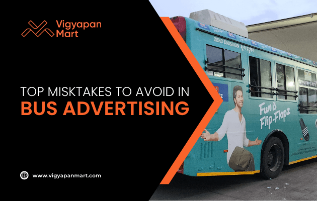
Top Mistakes You Need to Avoid with Bus Advertising
Bus advertising can boost visibility, but common mistakes—like poor design placement, weak CTAs, and ignoring local regulations—can harm your brand. Avoid these pitfalls with clear messaging, strategic planning, and thorough testing to maximize campaign effectiveness and audience engagement.
Bus advertising is a powerful tool for reaching a broad audience. With buses traveling through busy streets and neighborhoods, your brand can gain significant visibility. However, poorly executed bus ads can backfire, wasting your budget and even damaging your brand's reputation. To help you make the most of this advertising medium, here are the top mistakes to avoid when designing and placing bus ads.
1. Poor Placement of Key Information
One of the most common mistakes in bus advertising is placing critical information—such as contact details or slogans—in areas that are obstructed by bus features like windows, doors, or lights. For example:
- Ads placed over moving windows can distort images or text when passengers open them.
- Contact numbers or URLs hidden near tail lights or bumpers become unreadable.
Solution: Always research the layout of the bus you’re advertising on. Test your design on a mock-up to ensure all key information remains visible and legible from a distance.
2. Ignoring Readability
Bus ads are seen by people on the move—drivers, pedestrians, and commuters. Complex designs or small fonts make it difficult for viewers to grasp your message quickly.
Common readability issues include:
- Overcrowded text.
- Poor contrast between text and background colors.
- Fonts that are too small or overly stylized.
Solution: Use bold, high-contrast colors and large, simple fonts. Stick to minimal text—ideally 5-7 words for headlines—and ensure your message is clear at a glance.
3. Overlooking the Target Audience
A bus ad should resonate with its intended audience. Placing generic or irrelevant messages can lead to missed opportunities.
Mistakes include:
- Advertising luxury products in low-income neighborhoods.
- Using language or visuals that don’t align with local culture.
Solution: Research the routes covered by the buses carrying your ad. Tailor your message to fit the demographics and preferences of people in those areas.
4. Neglecting Design Consistency
Inconsistent branding confuses viewers and dilutes your message. A poorly designed ad may fail to convey professionalism or trustworthiness.
Examples of inconsistent design issues:
- Mismatched color schemes that don’t align with your brand identity.
- Using multiple fonts that clash visually.
- Including low-quality images or graphics.
Solution: Stick to your brand’s style guide for colors, fonts, and logos. Hire professional designers who understand how to create visually appealing ads for transit media.
5. Forgetting About Movement and Environment
Bus ads are unique because they are constantly in motion and interact with their surroundings. Failing to account for this dynamic nature can lead to embarrassing outcomes.
Examples of mistakes caused by movement/environment:
- Images of faces placed over windows get distorted when passengers open them.
- Ads that unintentionally interact with nearby objects (e.g., a funeral home ad reading “It’s all been bloody marvellous” on a moving bus).
Solution: Think about how your ad will look when the bus is moving or parked in different locations. Avoid placing critical visuals over areas prone to distortion.
6. Skipping Professional Proofreading
Typos and grammatical errors can make your brand appear unprofessional. Since bus ads are highly visible, even minor mistakes can attract widespread criticism.
Examples of errors
- Misspelled words in headlines.
- Incorrect phone numbers or URLs.
Solution: Double-check all text before finalizing your design. Have multiple people review it to catch errors you might miss.
7. Failing to Include a Clear Call-to-Action (CTA)
A great design is useless if viewers don’t know what action to take next. Many bus ads fail because they lack a compelling CTA.
Common CTA mistakes include
- Vague phrases like “Learn more” without specifying how.
- No contact details or website link.
Solution: Use clear, actionable language like “Call us at [number]” or “Visit [website] today.” Make sure the CTA is easy to spot within the design.
8. Ignoring Local Regulations
Every city has its own rules regarding transit advertising. Violating these regulations can lead to fines or removal of your ad campaign.
Examples of regulatory issues include
- Ads featuring offensive language or imagery.
- Designs that obstruct safety features on buses (e.g., emergency exits).
Solution: Familiarize yourself with local advertising guidelines before launching your campaign. Work with transit authorities to ensure compliance.
9. Not Testing Your Ad Before Launch
Launching an untested ad can lead to unforeseen problems, such as poor visibility or unintended interpretations.
Testing errors include
- Skipping mock-ups on actual bus models.
- Not reviewing how the ad looks under different lighting conditions (day vs night).
Solution: Conduct test runs by placing mock-ups on buses and gathering feedback from focus groups before rolling out your campaign citywide.
10. Overloading the Design with Information
While it’s tempting to include every detail about your product or service, too much information overwhelms viewers and dilutes your message.
Examples of information overload include
- Listing multiple phone numbers, websites, and social media handles.
- Including long paragraphs of text that no one has time to read.
Solution: Focus on one primary message per ad. Use supporting visuals instead of excessive text to convey additional context.
Summary Table: Common Mistakes vs Solutions
| Mistake | Impact | Solution |
|---|---|---|
| Poor placement of key info | Key details become unreadable | Test designs on mock-ups |
| Ignoring readability | Viewers miss the message | Use high contrast and large fonts |
| Overlooking target audience | Message fails to resonate | Research routes and demographics |
| Neglecting design consistency | Confusion about branding | Follow a style guide |
| Forgetting movement/environment | Distorted visuals | Avoid placing key elements over windows/doors |
| Skipping proofreading | Unprofessional appearance | Double-check all text |
| Weak call-to-action | Viewers don’t act | Include clear CTAs |
| Ignoring local regulations | Campaign removal/fines | Study city-specific guidelines |
| Not testing before launch | Unforeseen design flaws | Conduct mock-up tests |
| Overloading design | Viewers overwhelmed | Focus on one primary message |
Conclusion
Bus advertising offers incredible reach, but only if executed correctly. By avoiding these common mistakes such as poor placement, cluttered designs, and weak CTAs, you can ensure your campaign grabs attention for all the right reasons. Remember, simplicity, clarity, and strategic planning are key to making an impact with transit advertising!
Are you looking for professional help for your next Bus Advertising campaign? Connect with Vigyapan Mart today.
Subscribe to our newsletter
Get updates instantly! Join our community for the latest marketing insights.