Common Mistakes to Avoid for Your 2025 Outdoor Advertising Campaign
To ensure your 2025 outdoor advertising campaign is successful, avoid common mistakes like cluttered design, poor placement, vague messaging, and inconsistent branding. Focus on clarity, simplicity, proper visibility, and a clear call-to-action to maximize impact and ROI.
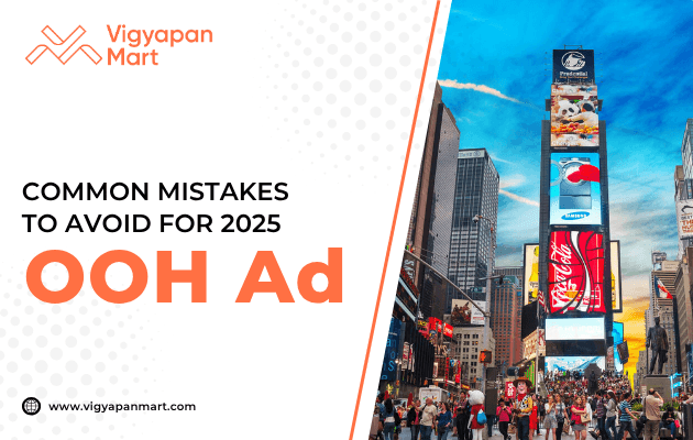
Outdoor advertising remains one of the most impactful ways to grab attention and build brand awareness. From billboards to banners, these ads can reach a wide audience in a short time. However, creating an effective outdoor advertising campaign is no easy feat. Many brands unknowingly make mistakes that can lead to wasted budgets and missed opportunities. To help you avoid such pitfalls, here’s a guide for all of you.
1. Cluttered Designs
A cluttered design is one of the most common reasons outdoor ads fail. When you overload your ad with too much information, it becomes overwhelming and unreadable.
Why Is It a Problem?
- Passersby typically have only a few seconds to absorb your message.
- Excessive text or visuals confuse viewers, reducing the ad's impact.
How to Avoid It
- Stick to one central idea or message.
- Use minimal text—6-7 words is ideal for billboards.
- Incorporate white space to make the design visually appealing.
Example: A billboard with a clean layout and bold headline like “Drive Electric – Visit EV Motors Today!” is far more effective than one crammed with product details and multiple CTAs.
2. Vague or Unclear Messaging
Your audience should immediately understand what your ad is about. A vague message leaves viewers puzzled, which means your campaign fails to deliver results.
Why It’s a Problem
- Ambiguity leads to confusion, making it hard for viewers to connect with your brand.
- A lack of focus dilutes your campaign's effectiveness.
How to Avoid It
- Craft a clear and concise message that resonates with your target audience.
- Use simple language that even a teenager can understand.
- Ensure your visuals align with your message for better comprehension.
Pro Tip: Test your messaging on a small focus group before launching the campaign.
3. Poor Placement of Ads
Even the best-designed ad will fail if placed in the wrong location. Placement plays a crucial role in determining how many people see your ad and whether it reaches the right audience.
Why It’s a Problem
- Ads placed in low-traffic areas won’t get enough visibility.
- Poor positioning (e.g., too high, too low) can make ads hard to read due to sunlight or obstructions.
How to Avoid It
- Choose high-traffic locations like busy intersections or shopping centers.
- Ensure the ad is at eye level or slightly above for maximum visibility.
- Conduct thorough research on footfall and vehicular traffic patterns before finalizing locations.
4. Using Fonts That Are Too Small
The font size on outdoor ads must be large enough for people to read from a distance. Tiny fonts make your ad ineffective because they’re illegible.
Why Is It a Problem?
- Viewers don’t have time to squint at small text while driving or walking by.
- Important details like contact information may go unnoticed.
How to Avoid It?
- Use bold, legible fonts that are readable from at least 20 feet away.
- Avoid overly decorative fonts that sacrifice clarity for style.
Tip: Test readability by viewing your design from different distances before finalizing it.
5. Lack of Brand Consistency
Your outdoor ads should align with your brand identity. Inconsistent colors, fonts, or messaging can confuse customers and weaken brand recall.
Why Is It a Problem?
- Inconsistencies make it harder for audiences to associate the ad with your brand.
- A disjointed campaign reduces trust and credibility.
How to Avoid It
- Use your brand's official colors, logo, and tone of voice consistently across all ads.
- Ensure alignment between outdoor ads and other marketing materials like social media posts or brochures.
6. Overloading Ads with Text
Outdoor ads are not meant for storytelling—they’re designed for quick consumption. Including too much text can overwhelm viewers and dilute the key message.
Why Is It a Problem?
- People don’t have time to read long paragraphs while passing by.
- An overloaded ad looks unprofessional and cluttered.
How to Avoid It
- Limit text to essential information like your tagline or CTA.
- Use bullet points if multiple pieces of information are necessary.
7. Ignoring Call-to-Actions (CTAs)
A clear call-to-action (CTA) is essential for guiding viewers on what they should do after seeing your ad.
Why Is It a Problem?
- Without a CTA, viewers may not take any action, rendering the ad ineffective.
- Missed opportunities for engagement or conversions.
How to Avoid It
- Include simple CTAs like “Visit Us Today,” “Call Now,” or “Shop Online.”
- Make sure the CTA is prominent and easy to spot.
8. DIY Creative Work
While it may seem cost-effective, designing an outdoor ad without professional help often leads to subpar results.
Why Is It a Problem?
- Amateur designs lack polish and professionalism.
- Poor-quality visuals can harm your brand image.
How to Avoid It
- Hire experienced designers or agencies specializing in outdoor advertising.
- Invest in high-quality graphics and printing.
Common Mistakes VS Solutions of Outdoor Advertising
| Mistake | Why It Fails | Solution |
|---|---|---|
| Cluttered Design | Overwhelms viewers | Stick to one idea; use white space |
| Vague Messaging | Confuses audience | Craft clear, concise messages |
| Poor Placement | Reduces visibility | Choose high-footfall areas |
| Small Fonts | Makes text unreadable | Use large, bold fonts |
| Lack of Brand Consistency | Weakens brand recall | Align design with brand identity |
| Too Much Text | Overloads viewers | Keep text minimal |
| No Clear CTA | Misses engagement opportunities | Add prominent CTAs |
| DIY Design | Looks unprofessional | Hire experts |
Conclusion
Outdoor advertising has immense potential, but even small mistakes can derail an entire campaign. By avoiding cluttered designs, poor ad messaging, poor placement, and other common pitfalls, you can ensure that your 2025 outdoor advertising campaign delivers maximum impact. Remember simplicity, clarity, and consistency are key!
Plan wisely, execute carefully, and watch as your outdoor ads turn heads—and drive results!
Are you looking for professional help in launching your next outdoor advertising campaign? Connect with Vigyapan Mart today.
Subscribe to our newsletter
Get updates instantly! Join our community for the latest marketing insights.