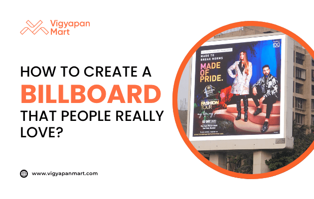
How to Create a Billboard that People Actually Love?
Learn how to create a billboard that’s not just seen but loved. This article explores proven strategies, design principles, emotional triggers, and real-world examples to help you craft unforgettable billboard advertising campaigns.
Billboards are one of the oldest yet most effective forms of advertising. They grab attention, communicate messages quickly, and leave lasting impressions. But not all billboards are created equal. Some are memorable and loved, while others fade into the background. So, how do you create a billboard that people genuinely love? Let’s break it down!
Why Do Billboards Matter?
Before diving into design tips, let’s understand why billboards remain relevant:
- High Visibility: Positioned in high-traffic areas, billboards reach thousands daily.
- Quick Impact: Drivers and pedestrians have only seconds to notice your ad.
- Cost-Effective Reach: Compared to other advertising forms, billboards provide a lower cost-per-impression.
Key Elements of a Great Billboard
Successful billboards share a few common traits. Here’s what makes them stand out:
| Element | Why It Matters |
|---|---|
| Simplicity | Viewers have 5–10 seconds to process your message. Keep it concise and clear. |
| Bold Fonts | Large, sans-serif fonts ensure readability from a distance. |
| Bright Colors | High-contrast colors grab attention and improve recall by up to 38%. |
| One Key Message | Focus on one idea or call-to-action to avoid overwhelming viewers. |
| Creative Visuals | Unique designs or interactive elements make your billboard unforgettable. |
Step-by-Step Guide to Designing a Billboard People Love
1. Keep It Simple
- Use fewer than seven words for your main message.
- Limit yourself to three visual elements (e.g., logo, image, tagline).
- Avoid clutter - too much information dilutes your message.
- Example: A Coca-Cola billboard might simply say “Taste Happiness” with an image of their iconic bottle.
2. Choose Bold and Readable Fonts
- Use sans-serif fonts like Arial or Helvetica for better visibility.
- Ensure text height is at least 24 inches for readability from 500 feet away.
- Avoid script or decorative fonts that are hard to read at a glance.
3. Play With Colors
- Use contrasting colors for text and background (e.g., white text on a red background).
- Align colors with your brand identity while ensuring they pop visually.
- Studies show bright colors improve brand recall significantly.
4. Use Eye-Catching Visuals
- Incorporate one dynamic image rather than multiple small ones.
- Explore creative ideas like extending visuals beyond the billboard frame or using shadows for added intrigue.
- Example: Toyota once created a functional rock-climbing wall as part of its billboard design!
5. Make It Relatable
Understand your audience and design accordingly:
- Use humor, emotion, or aspirational messages that resonate with viewers.
- Example: Reddit’s “Find Your People” campaign highlighted niche communities, making it relatable and loved.
6. Include a Clear Call-to-Action (CTA)
Your billboard should inspire action:
- Add simple CTAs like “Visit Us Today” or “Call Now.”
- Ensure the CTA is easy to remember (e.g., short URLs or phone numbers).
7. Optimize for Location
Design with placement in mind:
- For highways, use large fonts and minimal text since viewers are moving quickly.
- In urban areas or at traffic lights, you can include slightly more detail as viewers have more time.
Common Billboard Mistakes to Avoid
Avoid these pitfalls to ensure your billboard is effective:
| Mistake | Why It’s Problematic |
|---|---|
| Overloading with text | Viewers won’t have time to read lengthy messages. |
| Using low contrast colors | Makes the design hard to read from afar. |
| Ignoring brand identity | A generic design won’t leave a lasting impression. |
| Using small fonts | Text becomes illegible at typical viewing distances. |
| Cluttering with too many visuals | Competes for attention and confuses the viewer. |
Creative Examples of Loved Billboards
- McDonald’s “Follow the Arches” Campaign: Used parts of its iconic golden arches as directional signs—minimalist yet genius.
- BBC’s Dracula Billboard: Incorporated shadows that transformed into vampire fangs at night, creating intrigue.
- Chick-fil-A’s Humor Ads: Used humor (e.g., cows urging people to eat chicken) to connect with audiences playfully.
- Absolut Vodka’s Luxury Ads: Turned everyday scenes like public transport into high-end experiences through creative visuals.
The Three-Second Rule
Remember this golden rule: Your billboard should communicate its message in three seconds or less. Why? That’s about how long drivers or pedestrians will look at it while passing by. To test this:
- Show your design to someone for three seconds.
- Ask them what they remember—if they can’t recall the message, simplify it further.
Conclusion
Creating a billboard that people love isn’t just about good design—it’s about connecting with your audience in a meaningful way while keeping things simple and visually striking. By following these tips and avoiding common mistakes, you can craft a billboard that not only grabs attention but also leaves a lasting impression. So go ahead—dream big, design boldly, and make your mark on the streets! And if you need expert assistance in creating a memorable billboard, connect with Vigyapan Mart.
Subscribe to our newsletter
Get updates instantly! Join our community for the latest marketing insights.